Logo systems

Logo

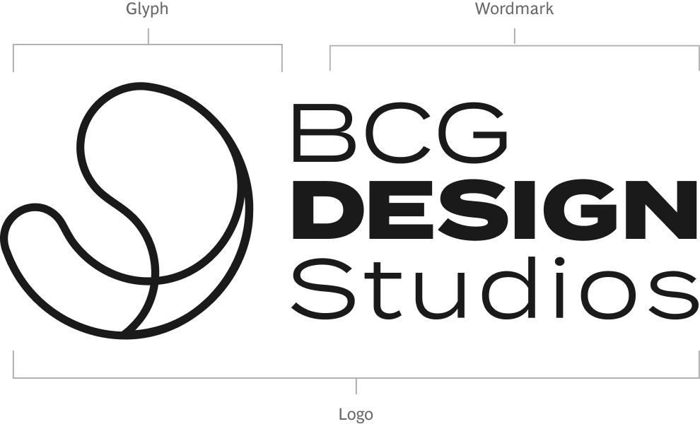
Our logo is a flexible, scalable system designed to perform consistently across every touchpoint—digital and physical.

It balances clarity with character, ensuring strong recognition without overpowering the content it supports.

Usage Principles

  • Use the primary logo for high-visibility applications
  • Use the glyph for small-scale or minimal branding
  • Maintain simplicity and avoid clutter

Glyph

The glyph/logomark/symbol with stroke-only design offers a minimal, flexible version of the logo, ideal for subtle branding, overlays, or small-format use.

BCG Design Studios glyph — stroke only version
Logo on orange gradient surface
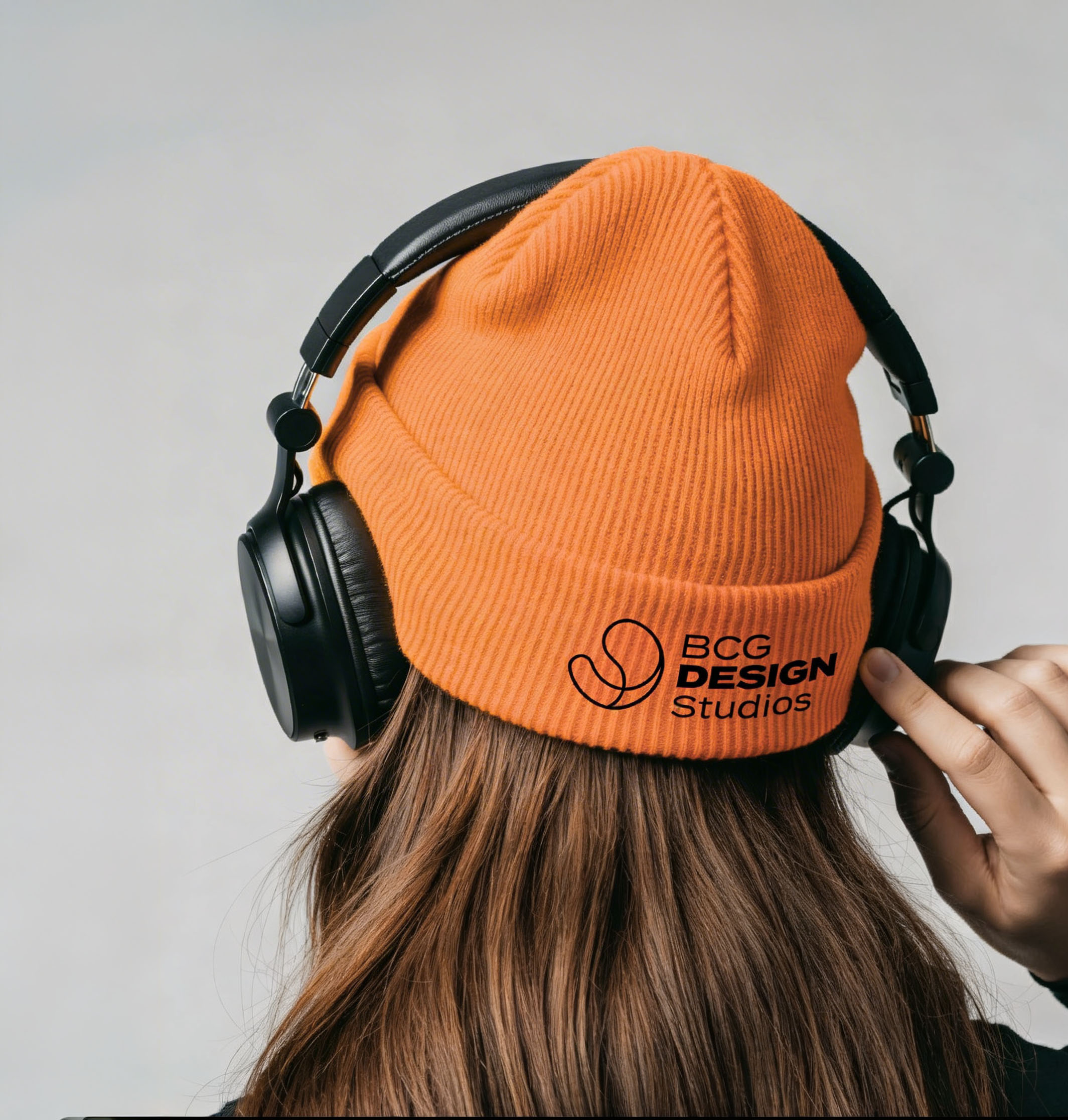
Branded beanie portrait
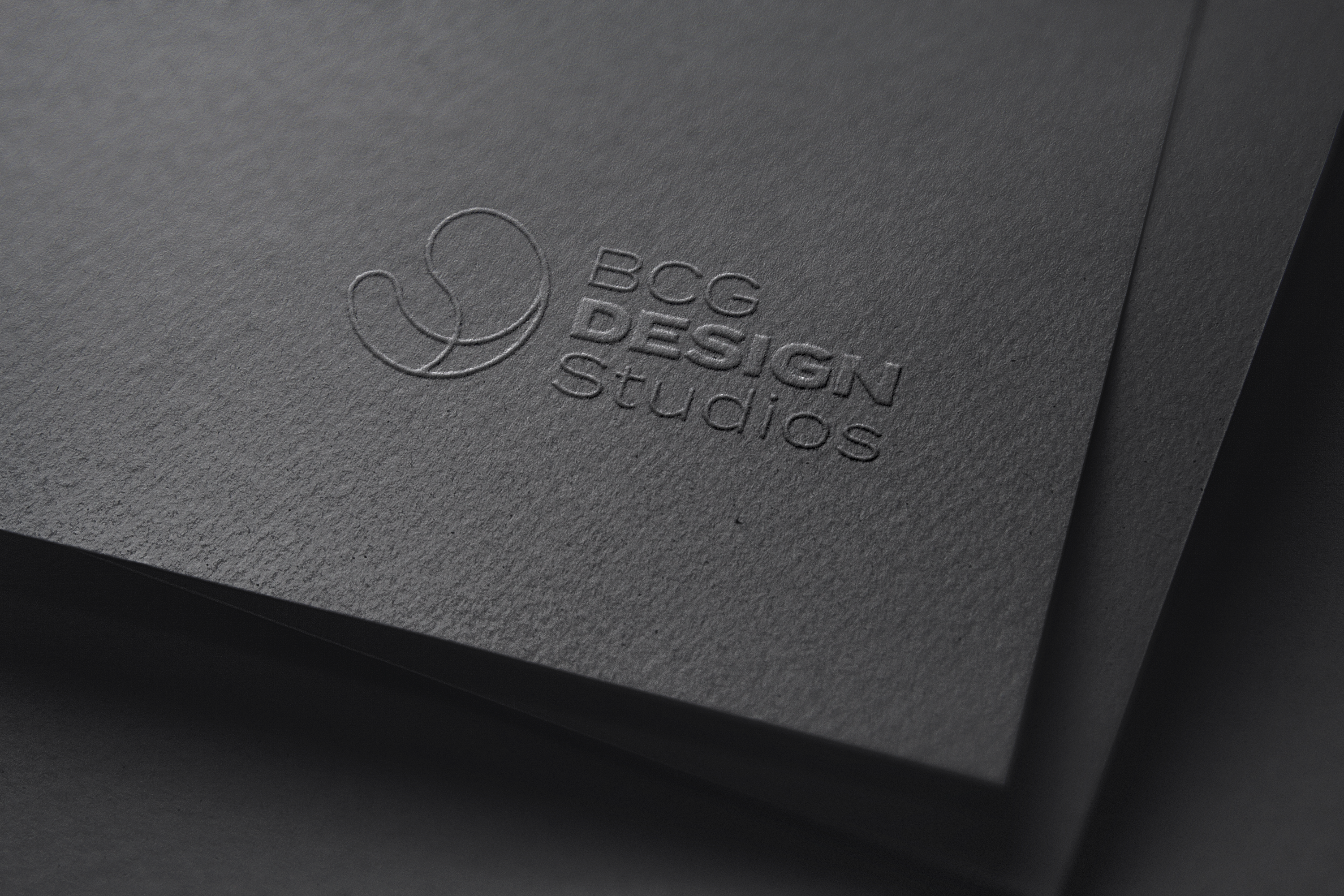
Logo on glossy black surface

Logo Construction

Built from a single grid. The glyph mark with stroke-only design offers a minimal, flexible version of the logo.

Logo construction grid diagram

Logo Clearspace

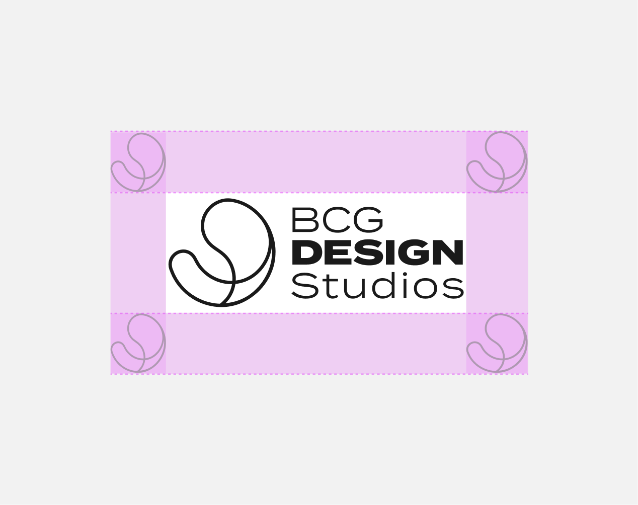
Design doesn't need borders. Logos do. Always preserve a minimum clear space equal to the width of the glyph on all sides.

Logo clearspace diagram

Logo Colorways

Color is the first visual thing we remember, and a powerful asset in building brand recognition. Our color is green. We use it first, last, and for nearly everything in between.

Go to color guidance.
Logo on lilac
Logo on Onix
Logo on Sunset Orange
Logo on Pulse Magenta

Positioning

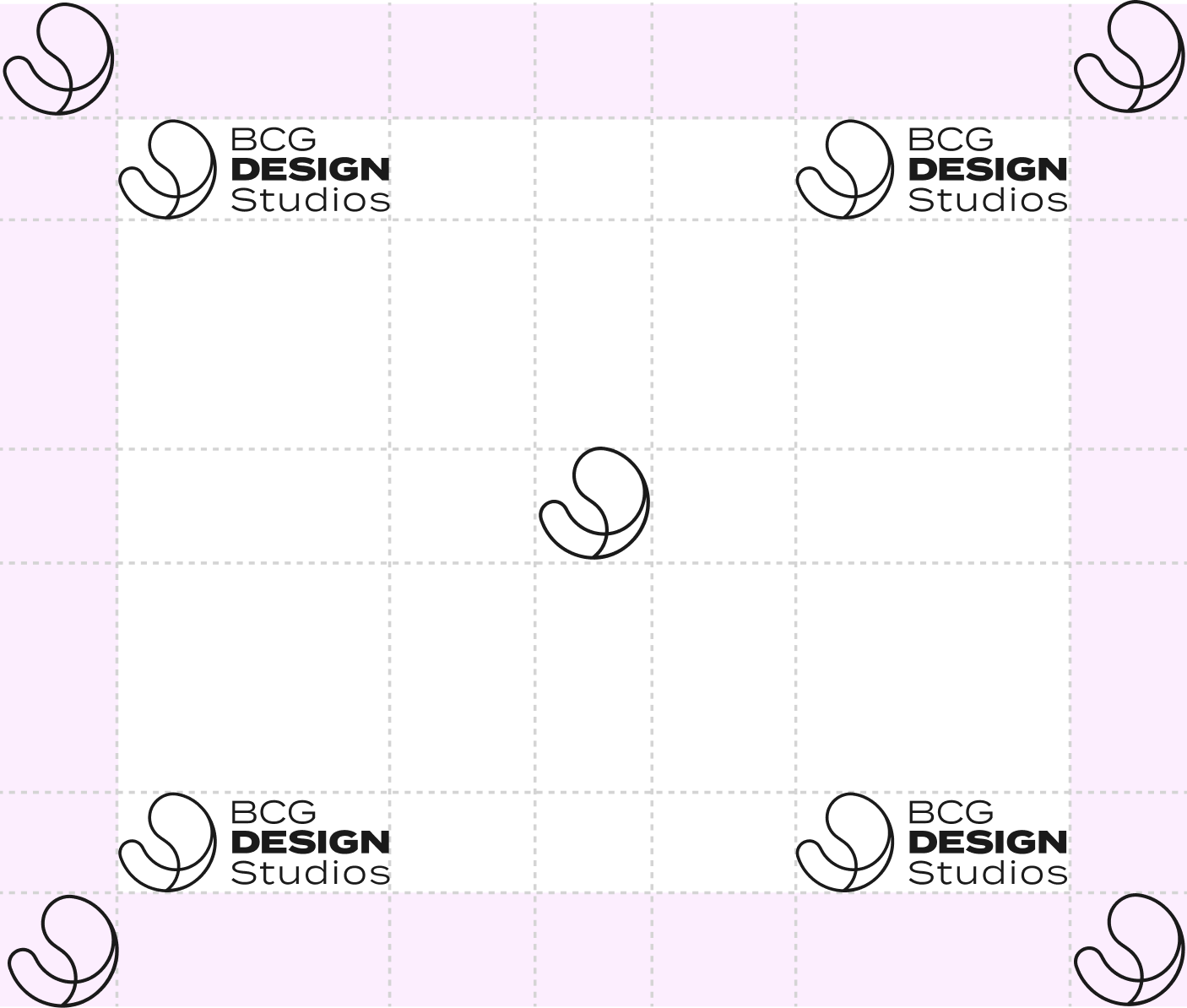
Default placement is corner-aligned. Center placement is acceptable when hierarchy allows.

Logo positioning diagram

Incorrect Usage

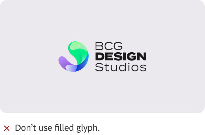
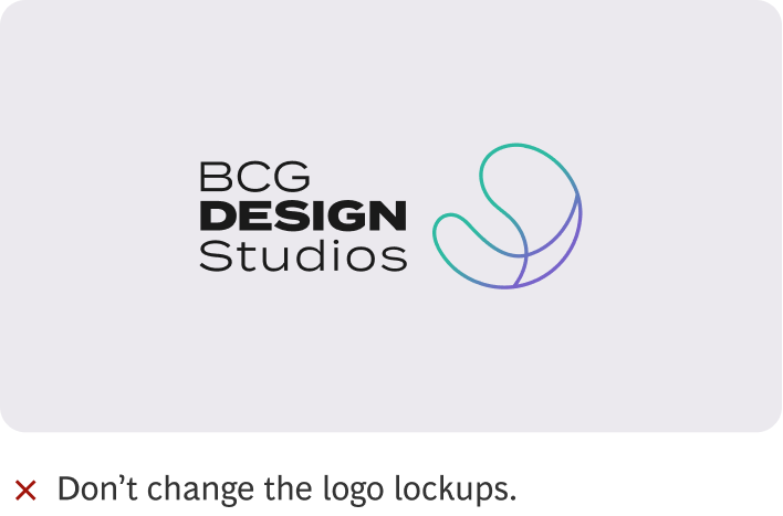
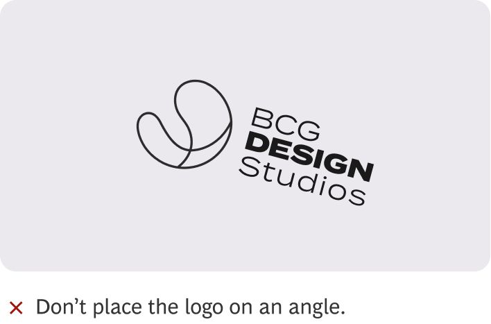
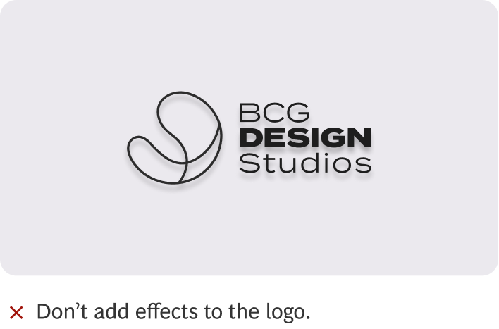
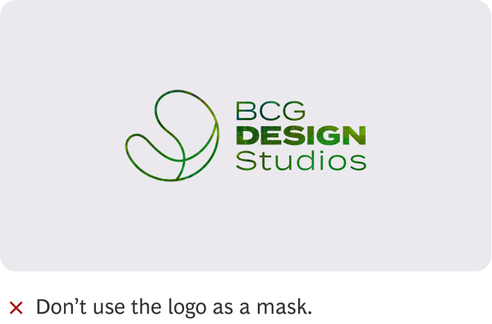
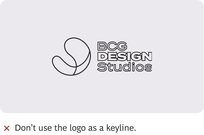
Don't use filled glyph Don't change the logo lockups Don't place the logo on an angle Don't add effects to the logo Don't use the logo as a mask Don't use the logo as a keyline

Partner Lockups

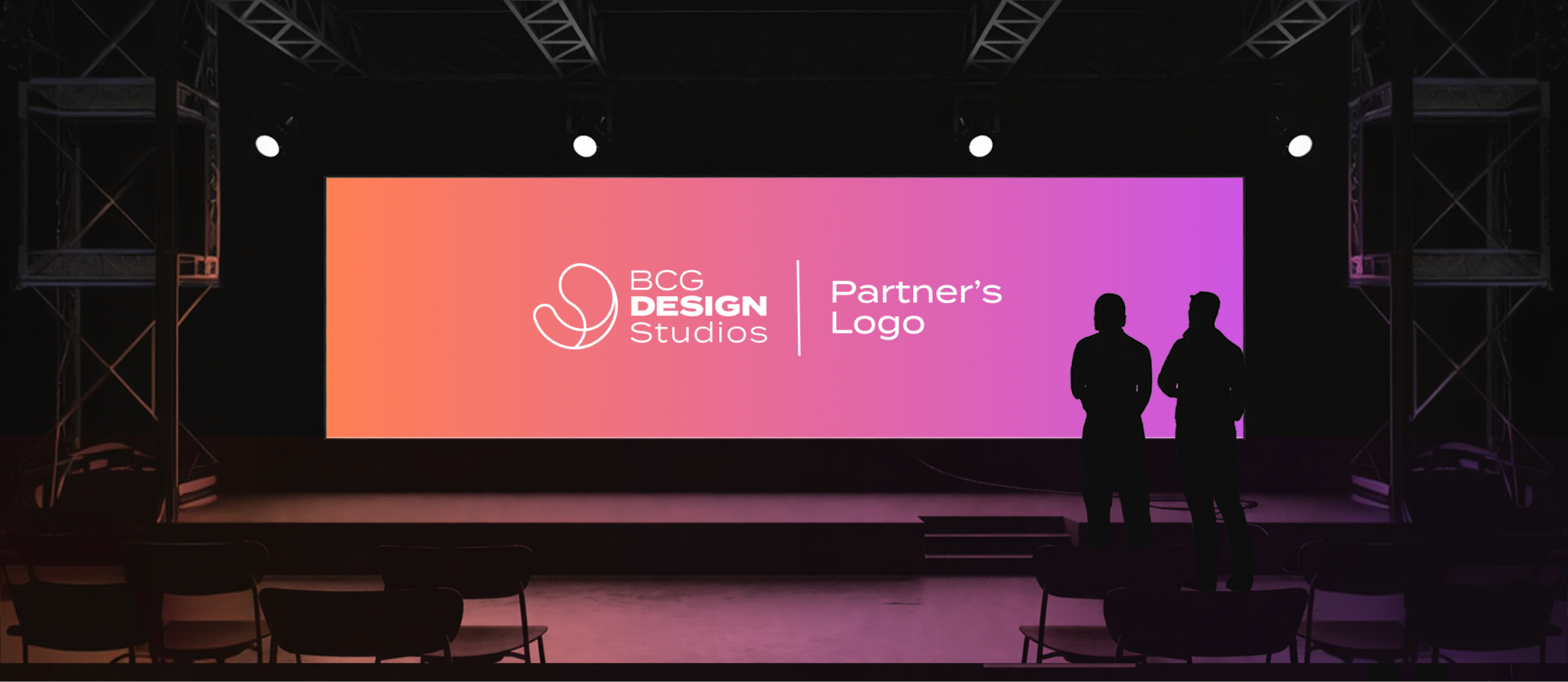
When we display a partner's logo alongside ours, we set it at the same height as our glyph so it's nice and consistent.

Partner lockup diagram
BCG Design Studios logo on LED screen at brand event

Download DS Logo

Access color swatches, palettes, and implementation guides