


COLOR SYSTEM

Color

Our color palette is vibrant and expressive. Each color has been carefully selected to create energy, establish hierarchy, and forge emotional connections with our audience. From bold primary colors to subtle neutrals, every hue plays a vital role in our visual identity.

Color palette band
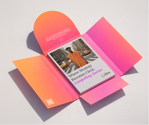
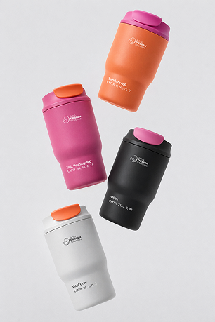
Portrait with orange gradient Orange tote bag Thermoses in various colors

Primary Palette

Sunflare

Sunflare

Sunflare is our energy source; a burst of warmth and optimism that powers the brand. It's bold enough to command attention, yet soft enough to feel human. Use it to create movement, highlight interaction, or infuse digital surfaces with warmth.

HEX #FF7F52
Volt

Volt

Volt is the brand's creative charge, our electric signature. It injects creativity and unexpected energy into any design. Use Volt for accents, transitions, and moments of visual excitement. It adds visibility in interfaces. Volt works best as a primary action highlight and identity color.

HEX #CD55E3
Polar White

Polar White

Frame White is the structural white of the brand system. Use it to emphasize hierarchy, create visual contrast, and maintain a sense of lightness across layouts.

HEX #FFFFFF
Cool Grey

Cool Grey

Milkcloud is our space-maker. It diffuses light rather than reflecting it, creating calm and helping every element feel intentional and considered.

HEX #EBE9EE
Onyx

Onyx

Onyx grounds the system. Deep, matte, and steady, it provides the weight that prevents other colors from feeling lightweight. In layouts it anchors everything; in typography it becomes the voice of confidence.


CMYK 0, 0, 0, 83

Supportive

Blush

Blush

A soft, romantic pink that adds warmth and approachability. Perfect for backgrounds, subtle accents, and creating gentle visual hierarchies.

HEX #F8E6FA
Mauve

Mauve

A sophisticated muted purple that brings elegance and depth. Ideal for supporting elements, subtle backgrounds, and adding refinement.

HEX #C4B4CC

Blush and Mauve extend the palette with softness and sophistication. They should always support the primary colors rather than replace them.

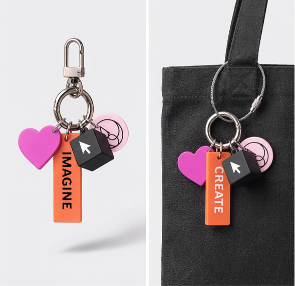
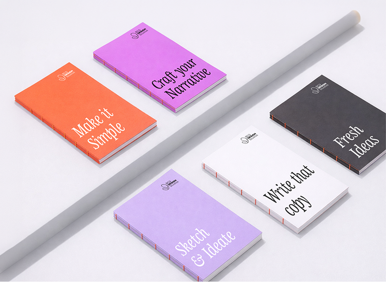
Keychains Notebooks

Gradients

Gradients are a signature expression of the brand's energy. Use approved combinations to create depth and motion. Avoid inventing new gradients or overusing them.

Main Gradient

Allowed Combinations

For Graphic Elements

Graphic Element Gradient 1 Graphic Element Gradient 2

Backgrounds & Fills

Background Gradient 1 Background Gradient 2 Background Gradient 3
Gradient example 1 Gradient example 2 Gradient example 3

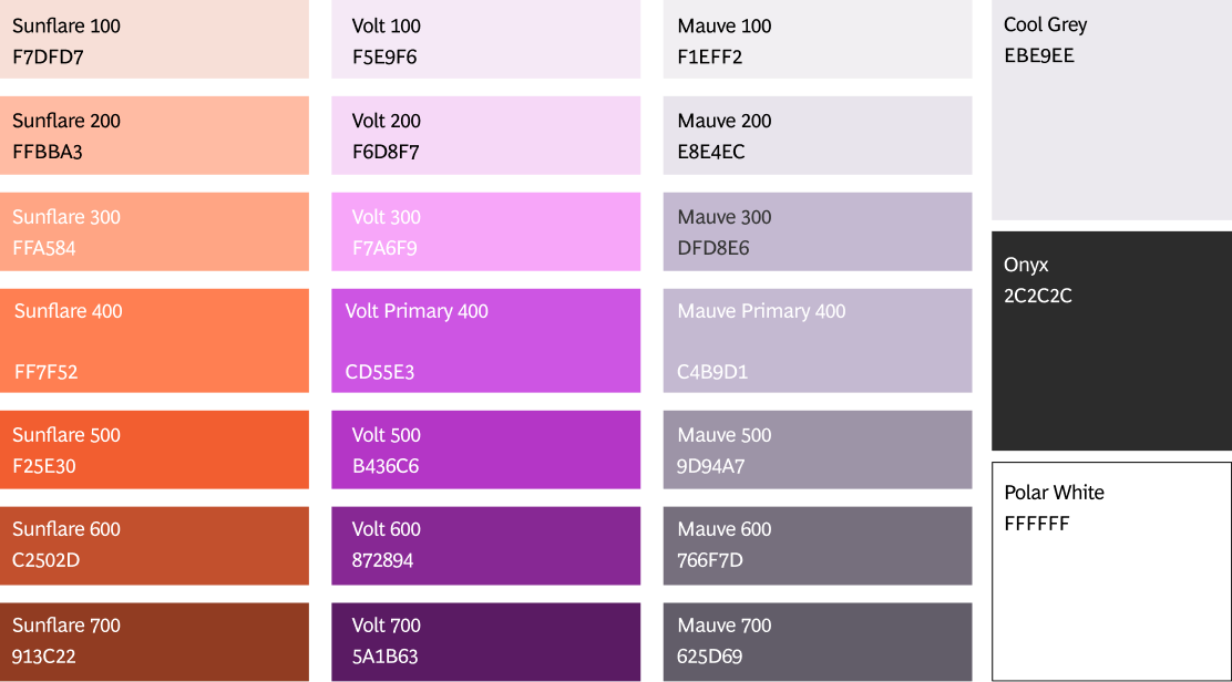
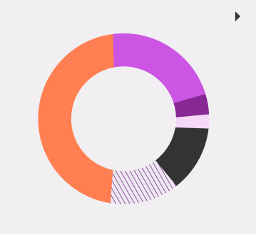
Hues & Tints

Expanded color scales are designed for data visualization, illustration, and layered systems. They provide flexibility while maintaining consistency.

Hues & Tints grid

When to use Hues & Tints

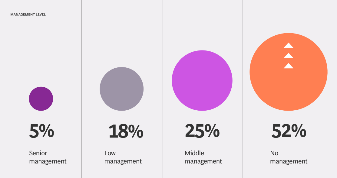
Management Level Stats
Illustration Moon Illustration Person Illustration Chart

Product Color

Element Light Mode Dark Mode Purpose
Primary Action
#ff7f52
#ff7f52
CTA buttons, links
Secondary Action
#cd55e3
#cd55e3
Secondary buttons
Body Text
#2c2c2c
#ffffff
Main content
Headings
#2c2c2c
#ffffff
Titles, headers
Background
#ffffff
#2c2c2c
Page background
Surface
#f8f8f8
#1a1a1a
Cards, containers
Product color mockup

Accessibility

All color combinations must meet accessibility standards. Contrast and readability should always take precedence over aesthetic preference.

Pass AAA Pass AAA Fail AAA Fail AAA

Resources

  • Figma Plugin
  • Contrast Checker

Incorrect Usage

Wrong color

Do not use the wrong color:

Do not use colors that are not in this guidelines color palette.

Replace brand colors

Do not replace the brand colors:

Do not use alternative hues to main brand colors. Hues and tints exist for cases where are needed such as illustration and data vizualisation

Eye dropper

Do pick colors with eye dropper:

The eye dropper tool is not 100% accurate, please refer to color libraries and values.

Random gradients

Do not use random gradients:

Only use the gradient combinations provided in these guidelines, do no create new combinations.

Tertiary hues alone

Do not use tertiary hues as stand alone:

Hues and tints are meant to be used complementary to the main color palette, never as a standalone.

Wrong color space

Do not use the wrong color space:

Please always refer to the correct use to the media you are working on.

Download Resources

Access color swatches, palettes, and implementation guides