Typography expresses both the intellectual rigor and creative depth of the brand. It should feel precise, confident, and editorial.
Typography
BCG HENDERSON SANS
The quick brown fox jumps
over the lazy dog.
ABCDEFGHIJKLMNOPQRSTUVWXYZ
VWXYZ
abcdefghijklmnopqrstuvwxyz
1234567890$%&*()!
Primary
structural typeface.
BCG HENDERSON
The BCG Henderson typographic system balances analytical precision with editorial depth.Henderson Sans provides structural clarity.Henderson Serif introduces emphasis and intellectual nuance.
BCG HENDERSON SERIF
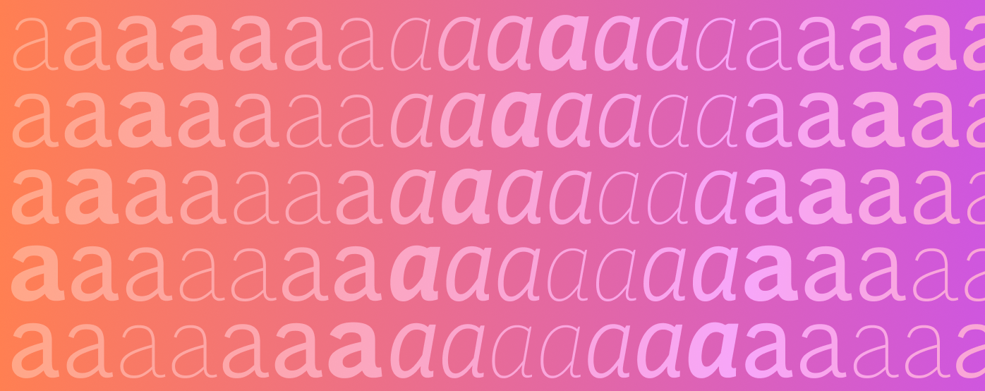
Aa Aa
Editorial and emphasis typeface.
HIERARCHY
Typography should clearly guide the reader through content. Strong contrast between headings and body text ensures clarity and engagement.
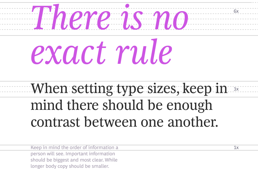
SCALE
Use scale intentionally. Headlines should create impact, while body text should remain highly readable. Maintain consistent spacing to create rhythm across layouts.
TRACKING
The spacing was carefully crafted for legibility when we created the typeface. Do not adjust the spacing.
Tracking for Display Text and Primary header is at 1%. Rest all are set to 0.

EMPHASIS
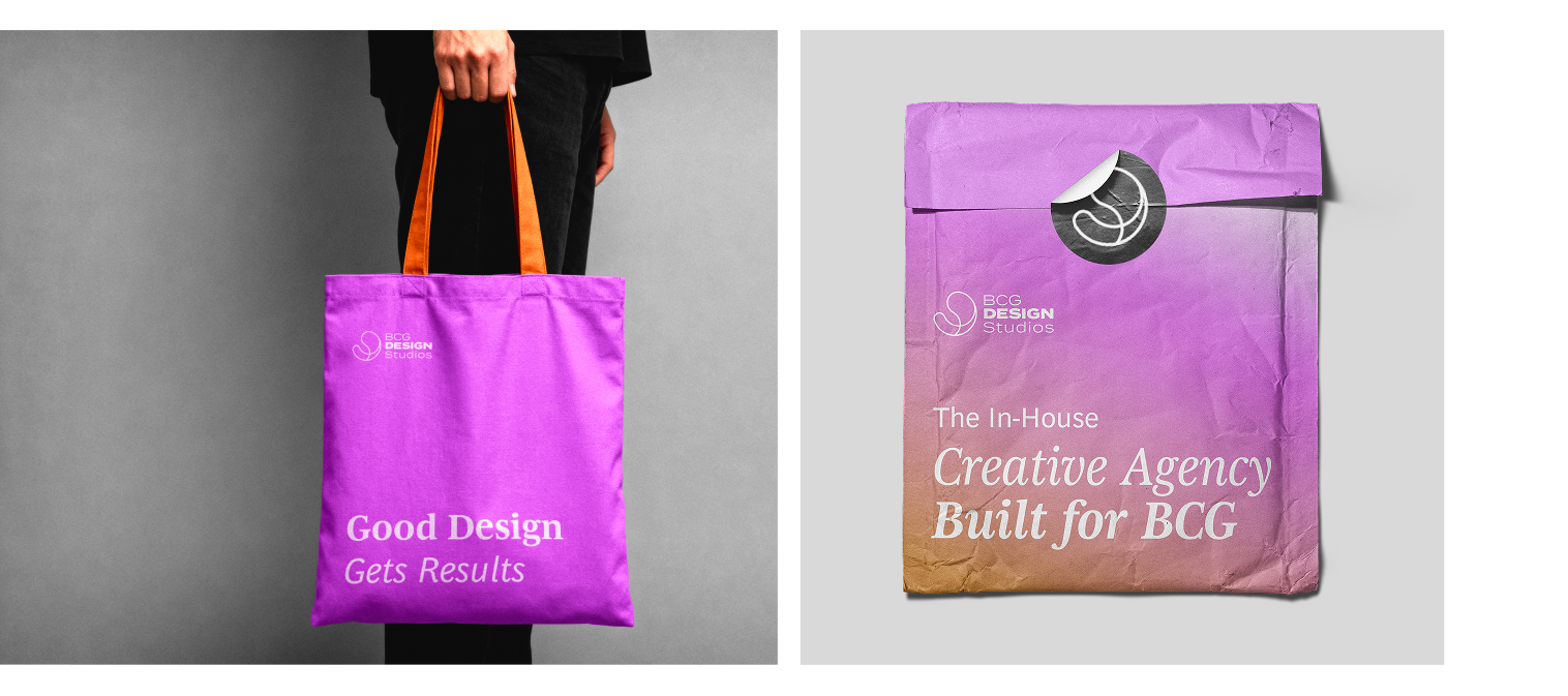
For extra amplification, bold and italicize select words in a headline. Do not use Bold italics in large paragraphs of text, and do not highlight multiple words in a sentence.
Bold Italic should be used sparingly and intentionally. They are not required for headlines.

PRINCIPLES
The following pages outline general type best practices. Use them as a reference any time our typeface is used.
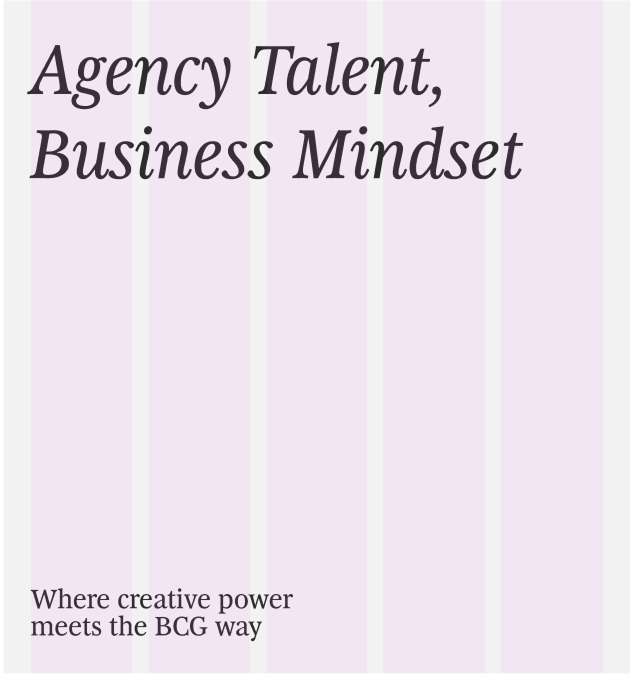
✓ Always place text along the grid.
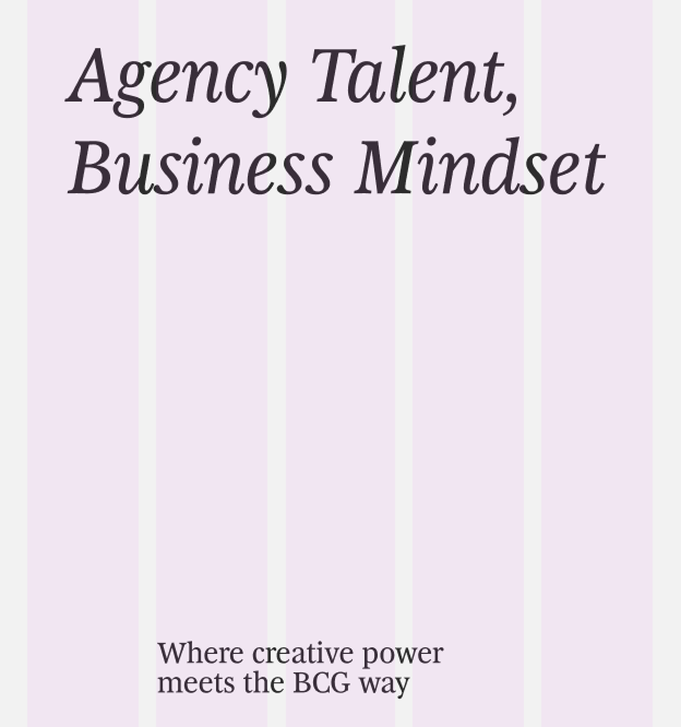
✕ Don't leave text floating.
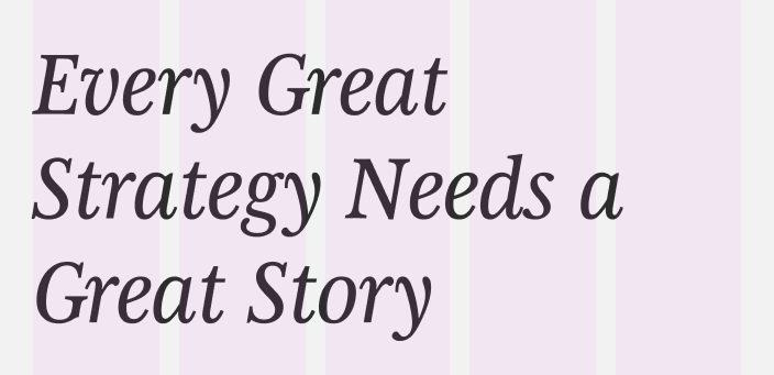
✓ Use text big, and stacked, left aligned.
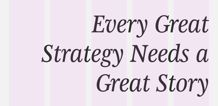
✕ Don't flush right align text.
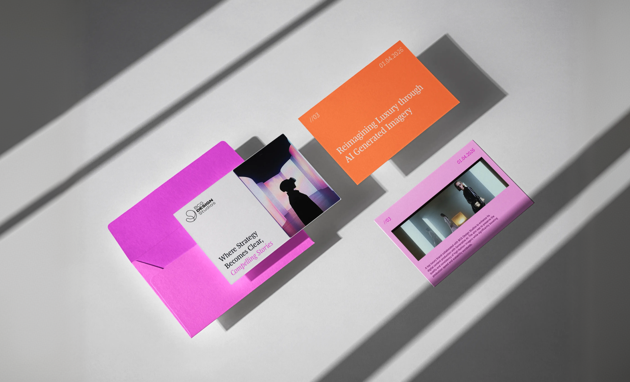
INCORRECT USAGE

✕ Don't use other typefaces.
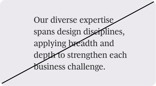
✕ Don't use BCG Henderson Serif as body copy.

✕ Don't use display for titlecase headlines.

✕ Don't add too much line spacing.

✕ Don't apply effects.

✕ Don't use outlined type.
Download Resources
Access color swatches, palettes, and implementation guides