Iconography
Icons are the visual throughline from product to brand. Our icon library helps strengthen and reaffirm our commitment to consistency and dependability.
Primary Icons (128px grid - Tier 01)
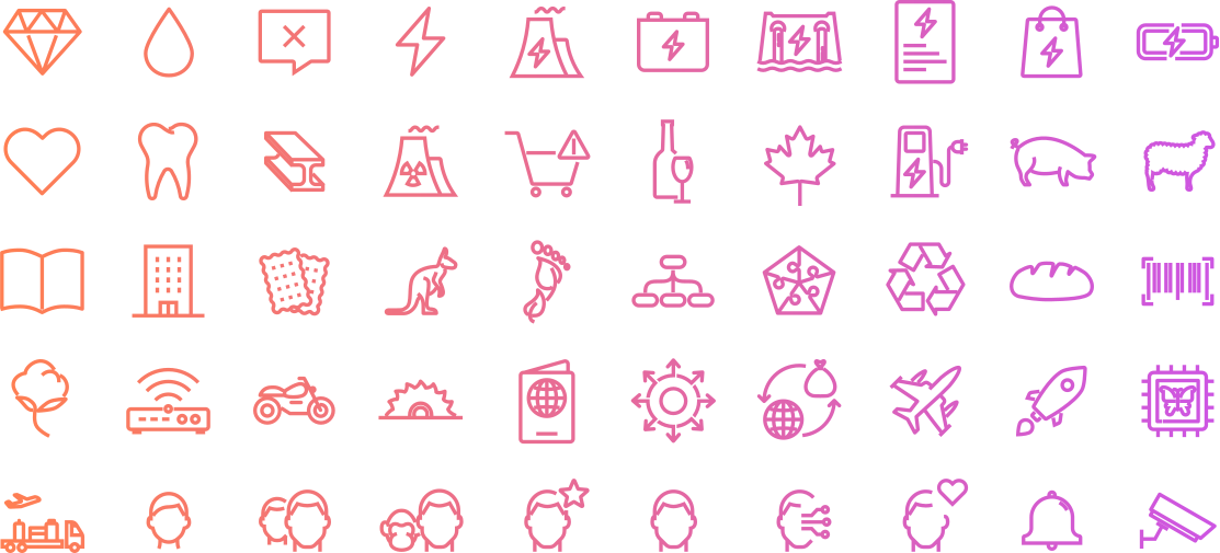
Primary Icons are the main set of icons based upon all the other tiers will be joined to in order to add any other meaning. These icons can be used on their own and straight away (e.g. cellphone)

Secondary Icons (56px grid - Tier 02)
Secondary Icons are used to add a second level of meaning to primary icons. For example you can have a leaf to add to any primary icon the meaning of 'sustainability'. These icons should not be used isolated, their main purpose is to be to add to tier 01.

Tertiary Icons (24px grid - Tier 03)
Tertiary Icons are used to add a third simpler level of meaning to primary icons. For example you can have an exclamation mark to add the meaning of "urgency" and these icons should not be used isolated, their main purpose is to add to tier 01 icons.